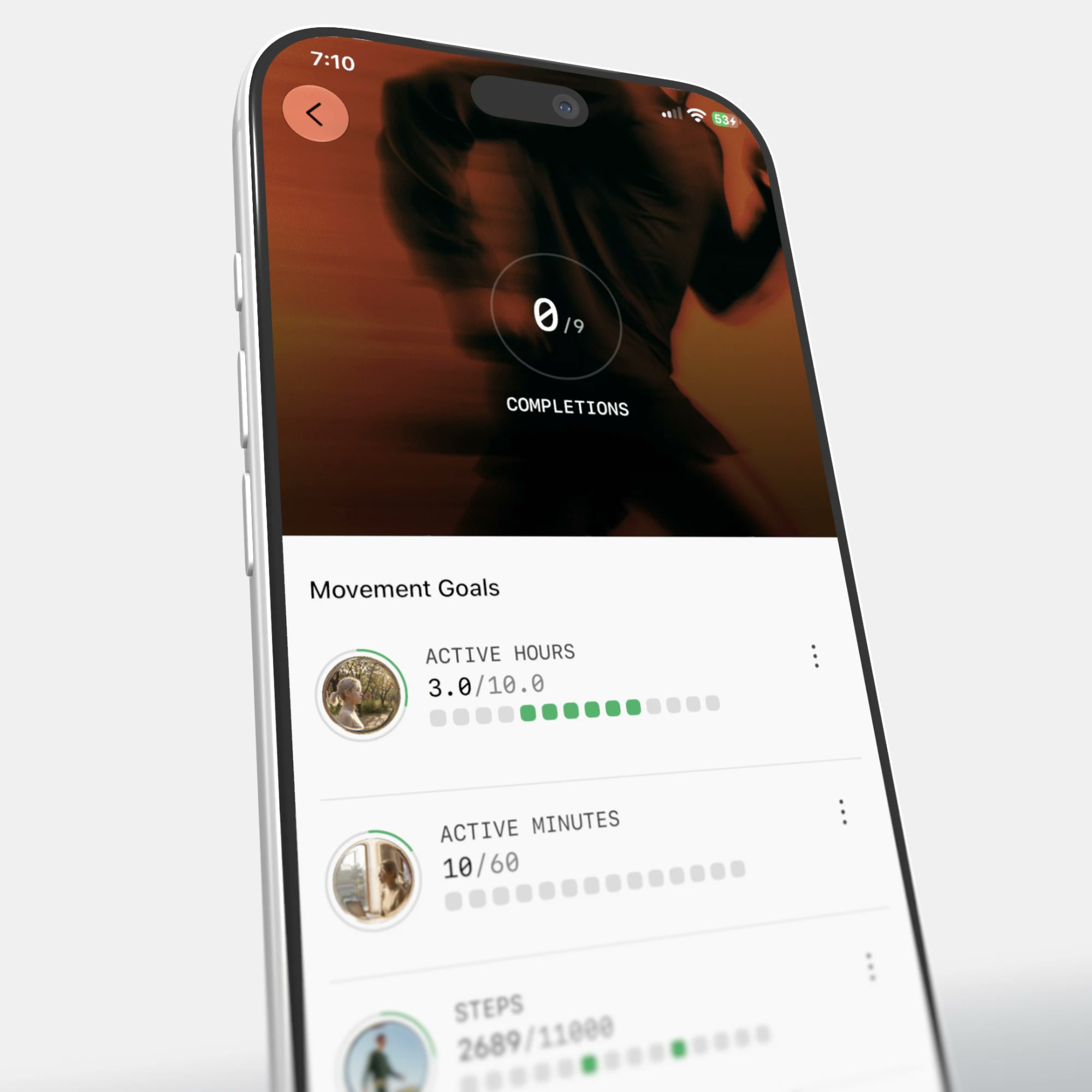
Ultrahuman App Revamp
One app, and every product Ultrahuman ships after it.
Four designers rebuilt it over two months. The app had a page for every metric and a tab for every product, so its shape came from what had been built rather than from what anyone opens an app to find out. The idea holding the rebuild together is that a day is a sequence rather than a stack of numbers, and Home is a single object that reads that sequence back to you.
Design Lead: Ritwik Sinha · Design: Nachiket Palkar
More than a redesign
The brief went past UX, navigation, layout and components. It included a new brand for the app, built to carry a Ring, a Home, a Blood Vision and whatever ships next. Most of that weight sits on one object: a 3D sphere we call the flux, which speaks in colour, speed, text and number, and says what your physiology points to doing now.Why liquid metal
Metal shaders are dynamic, and the animation never settles, which is where the name came from. The body is in flux through the day and the night too, so the material and the subject match. A new mix of colours changes the whole story without anyone learning a new chart: the same object can read calm or agitated, warm or cold, before a number has been parsed.Not limited by geometry
A sphere also settles a practical problem. It rotates without end, so there is no fixed set of positions to design around and the object never runs out of room. However much there is to carry, the same surface carries it.One clock, four windows
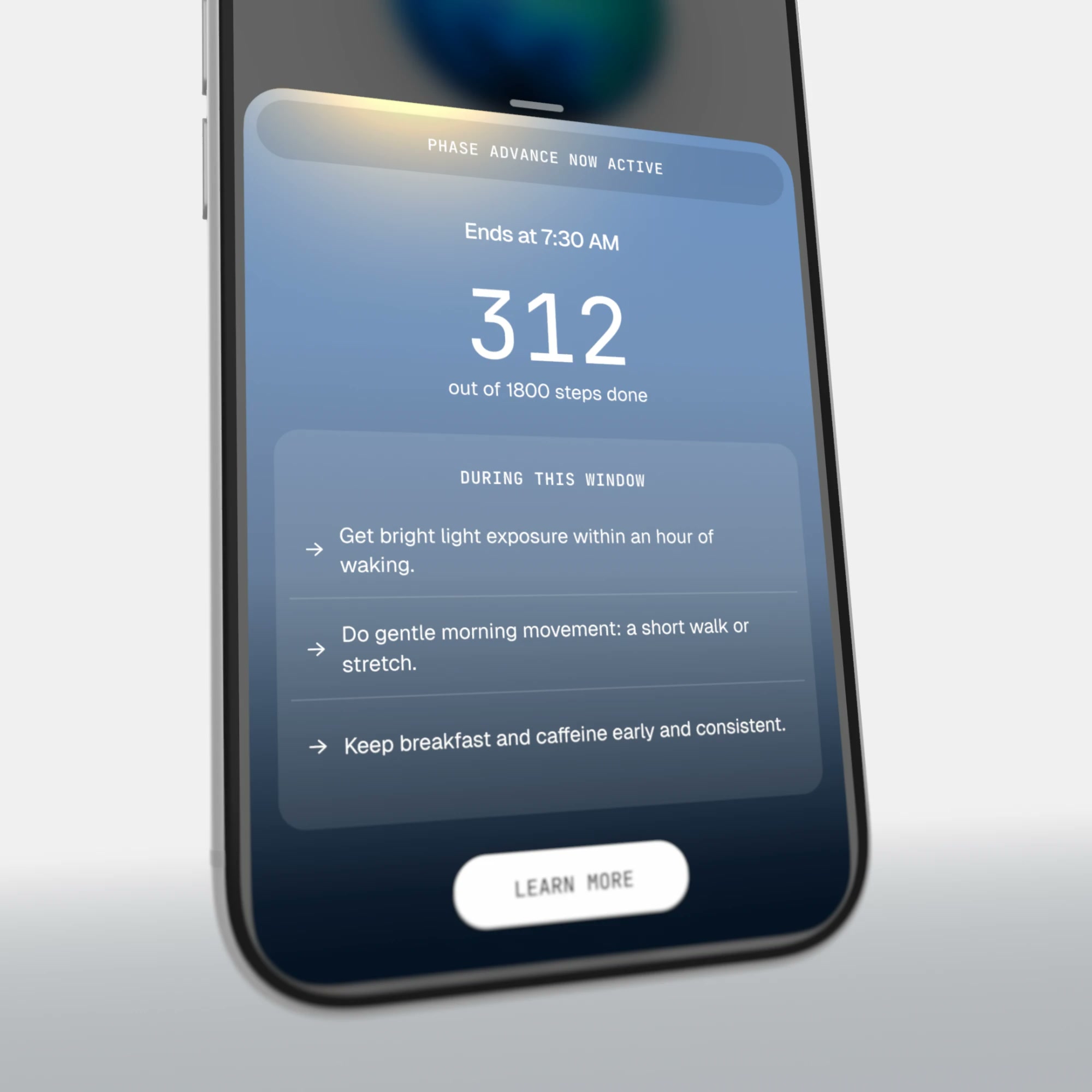
Circadian rhythm, caffeine, sunlight and screen time each had a page of their own, so comparing any two took several taps. Windows puts all four on one 24-hour view borrowed from a calendar, which almost everyone already reads. A Now bar says which phase you are in against each clock. Selecting one brings its phase forward, and the sheet under it carries when that window closes and what is worth doing before it does.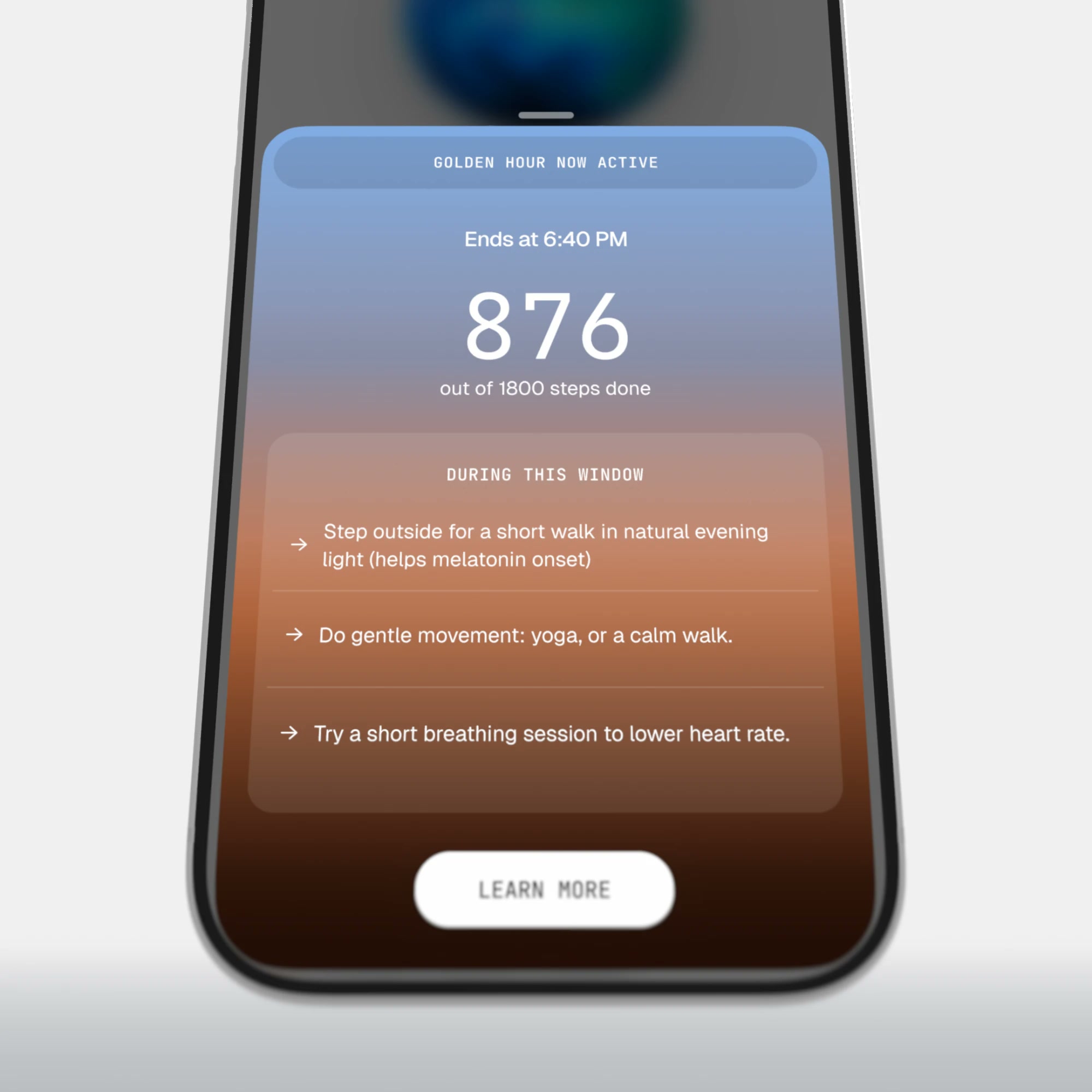
Fleeting by design
Windows changes by the hour, so the home screen needed components that pass with it. A pill states one thing and takes up no more room than that. Morning light is offered in the morning and golden hour at golden hour, because the same prompt an hour later asks you to act on something already gone.Calculated on the device
As much engineering as design. Raw ring data is processed on the phone now rather than sent to the backend and rendered on the way back. Pull down with haptics under the gesture and the live card comes with it, so a current number sits at the top of the screen instead of a queued one.Three readings went live
Moving the calculation onto the phone made three raw readings worth surfacing in real time. Heart rate is the one given the whole display, in the same shader as Home: not a separate chart or a separate language, just the number taken full screen for as long as it is worth watching.Modals that react live
A modal is the louder version, kept for actions that move a score directly. One arrives when heart rate runs above baseline and another when steps run high for the hour, pointing at stress and at a workout, each offering the matching action. The haptics under the shader are timed to your live heart rate, so the screen reads as alive rather than as one that updates.Next best action
Every surface ends in the same question: so what do I do now. One line answers it, drawn from the signals already on the screen, with the reasoning a tap behind it and the option to dismiss the whole thing.Where the one line runs out
Jade picks up where that line stops, offered at the foot of the same sheet rather than from a blank screen, so a question starts with whatever you were already reading. It has a tab of its own as well, since something you can ask anything of should not be reachable only from the moment that prompted it.Workout mode
Live mode carries two readings at once: the heart-rate zone, and heart rate across the last thirty minutes. The shader identity holds here, so the zone view belongs to the same system as Home rather than reading as a separate app bolted on.It keeps running
Few people hold a phone still for an hour. A session minimises into a bar above the tab bar and keeps recording, so the rest of the app stays available while it runs and nothing has to be restarted to go and check something.After the workout
Finishing has its own animation, and a loader runs while the summary is put together. The trace is banded by zone and scrubbable, so a peak comes back with its time attached: 169 at 7:05:37, in Zone 5. Underneath, the same session is split a second way, by the share of it spent in each zone, because a peak and a distribution answer different questions.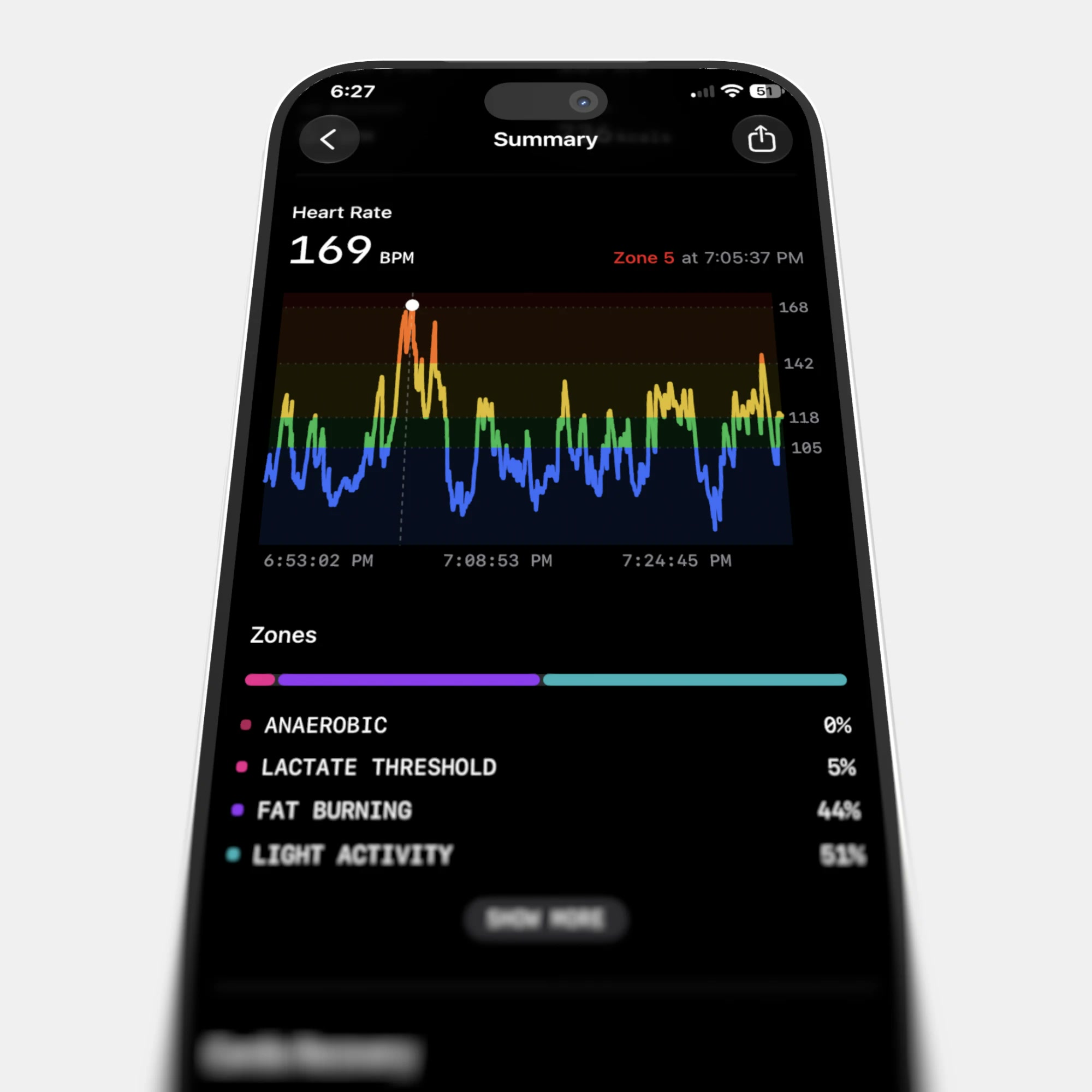
The number sensors miss
Perceived exertion is the one value no sensor can supply. Two sessions can trace almost identically and feel nothing alike, and that difference decides what is worth doing tomorrow. It is one drag, zero to ten, with the word changing under your thumb as the number does: 2 is mild, 6 is moderate. Nobody is left interpreting a bare number.Ultra Age
Longevity gets a page rather than a badge. One figure, the direction it is moving, and the three ages that make it up: pulse, blood and brain, with cardiovascular age and VO2 max alongside. A lab report can be uploaded to sharpen the estimate, and anything on the page can be taken to Jade and argued with.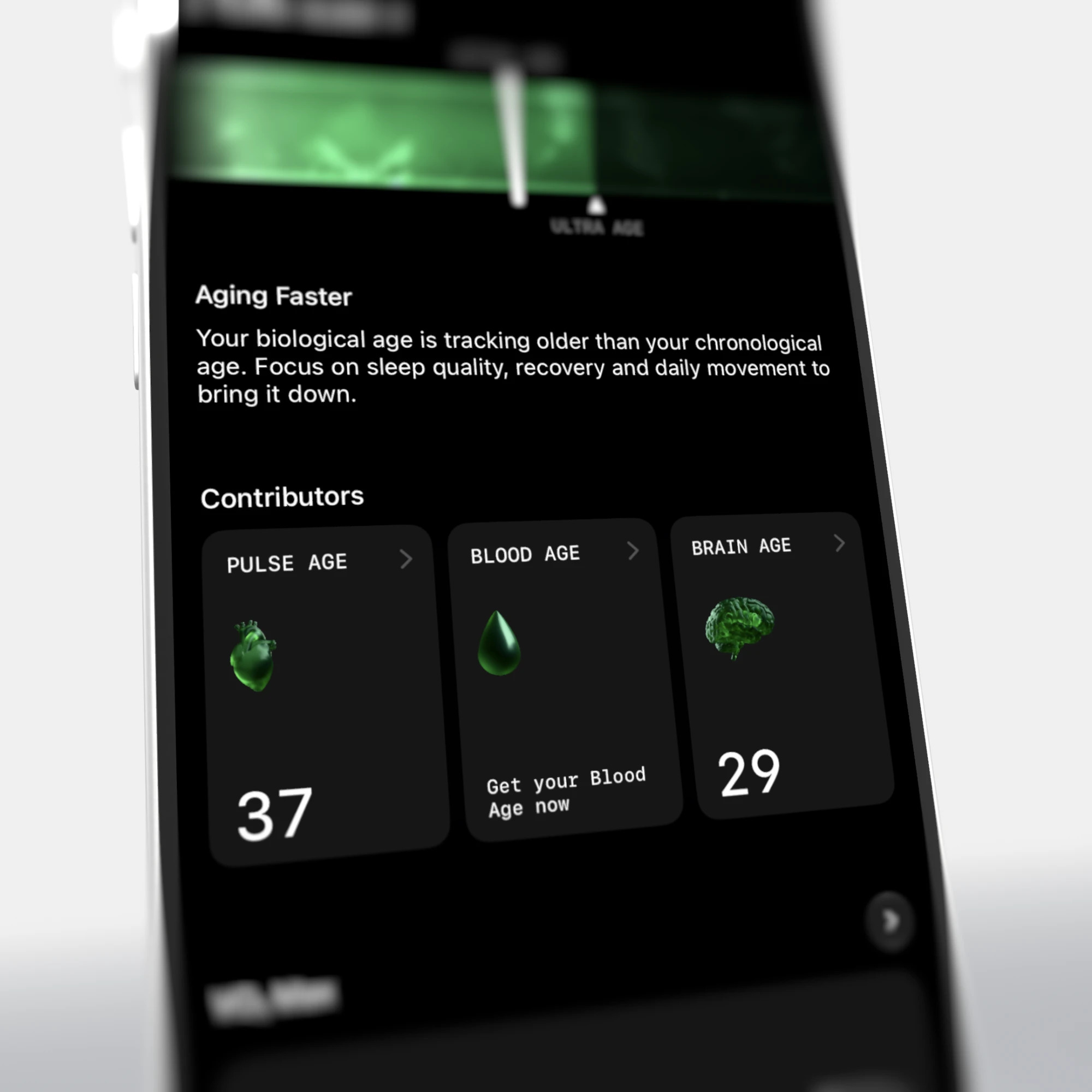
Switching products
The navigation bar used to hold every Ultrahuman product at once, which left most of the tabs meaningless to anyone who owned a single device. Products now switch from the chevron on the logo, and each one brings its own bar with it.Today's activities
Activity detection asks rather than asserts. A nap between 4:38 and 5:26 arrives as a row with a tick and a cross rather than as something already logged, so agreeing takes one tap and so does saying no. It is the fastest way to log a day and the only way the model gets corrected.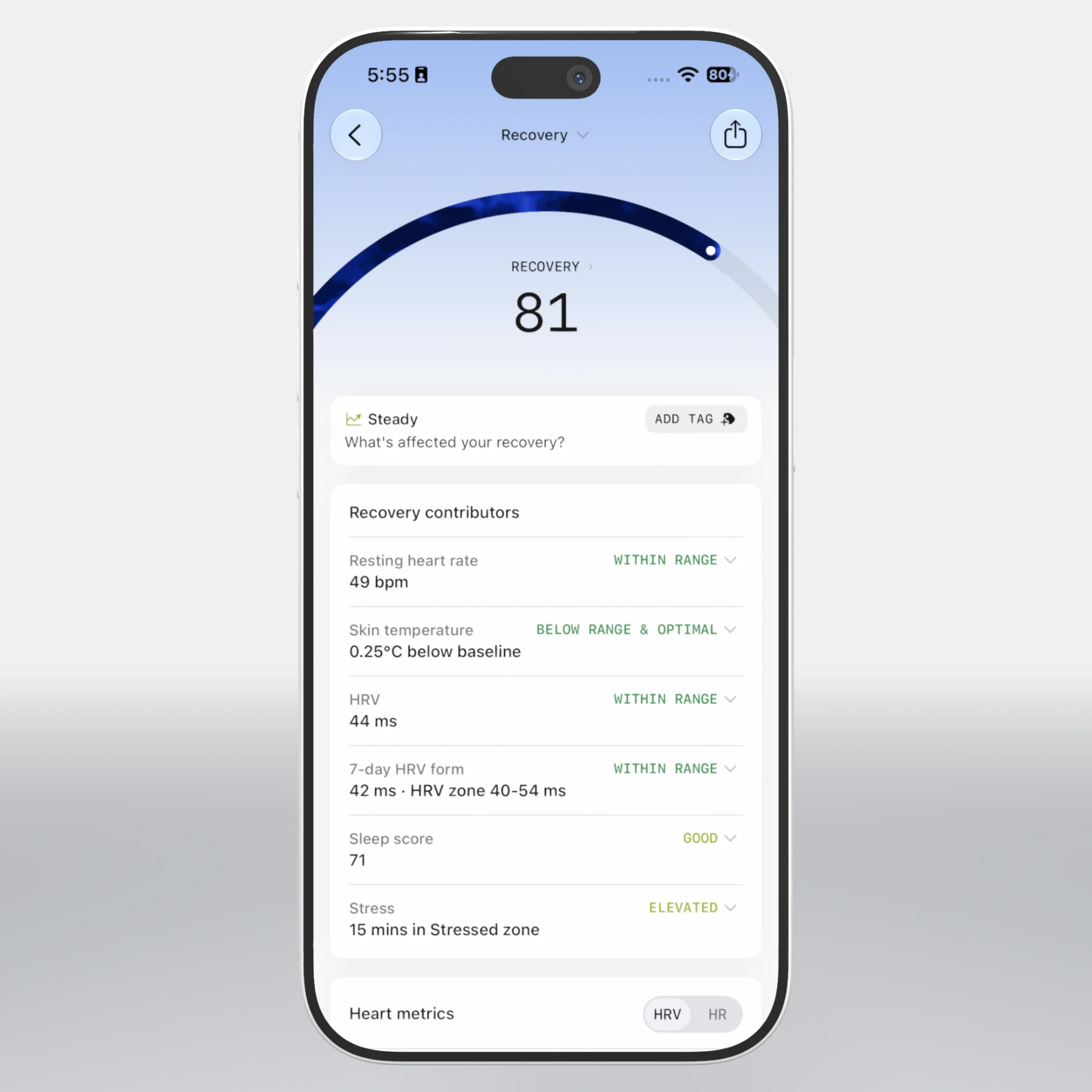
Biomarker detail pages
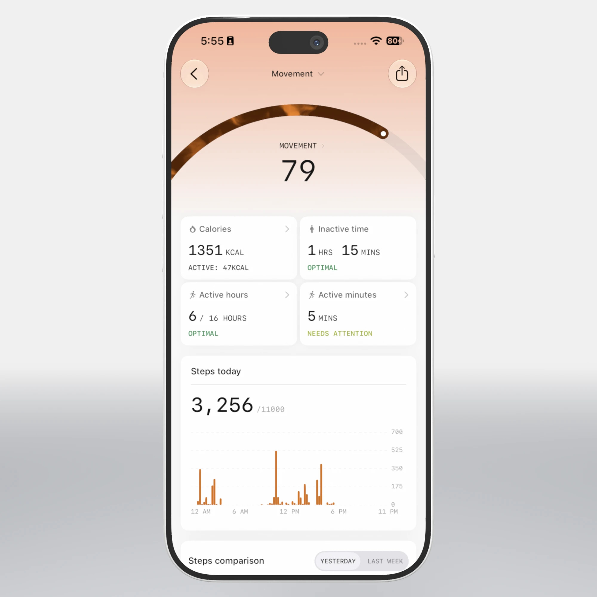
Every score opens into the same page: the figure, the arc it sits on, the week behind it, and a line of plain reading. Sleep, recovery and movement share it, so learning one teaches the rest. Each metric still gets the chart that suits it, bar, line or interval, with the baseline drawn in every case, so a day is shown against what is normal for you.Stress score redesign
Stress was one number for a whole day, with nowhere to point. It is now a timeline you scrub: stressed, stimulated, relaxed and activity-driven phases laid across the day, each carrying the share of the day it took and how long it ran. A stressed hour, a quiet afternoon and a workout no longer average each other away.New in health science
Very few health platforms carry current research at all. This one puts a sixty-word read on Home on what is new in longevity and health science. Each study carries a quality score for its design, its sample size and whether it was randomised, so a preliminary finding does not read like a settled one. A swipe moves to the next.Setting up the ring
The first screens anyone sees, and the only ones everyone sees. Sizing, pairing and the first sync, kept to a single instruction a screen, because this part gets done once, standing in a kitchen with the box still open.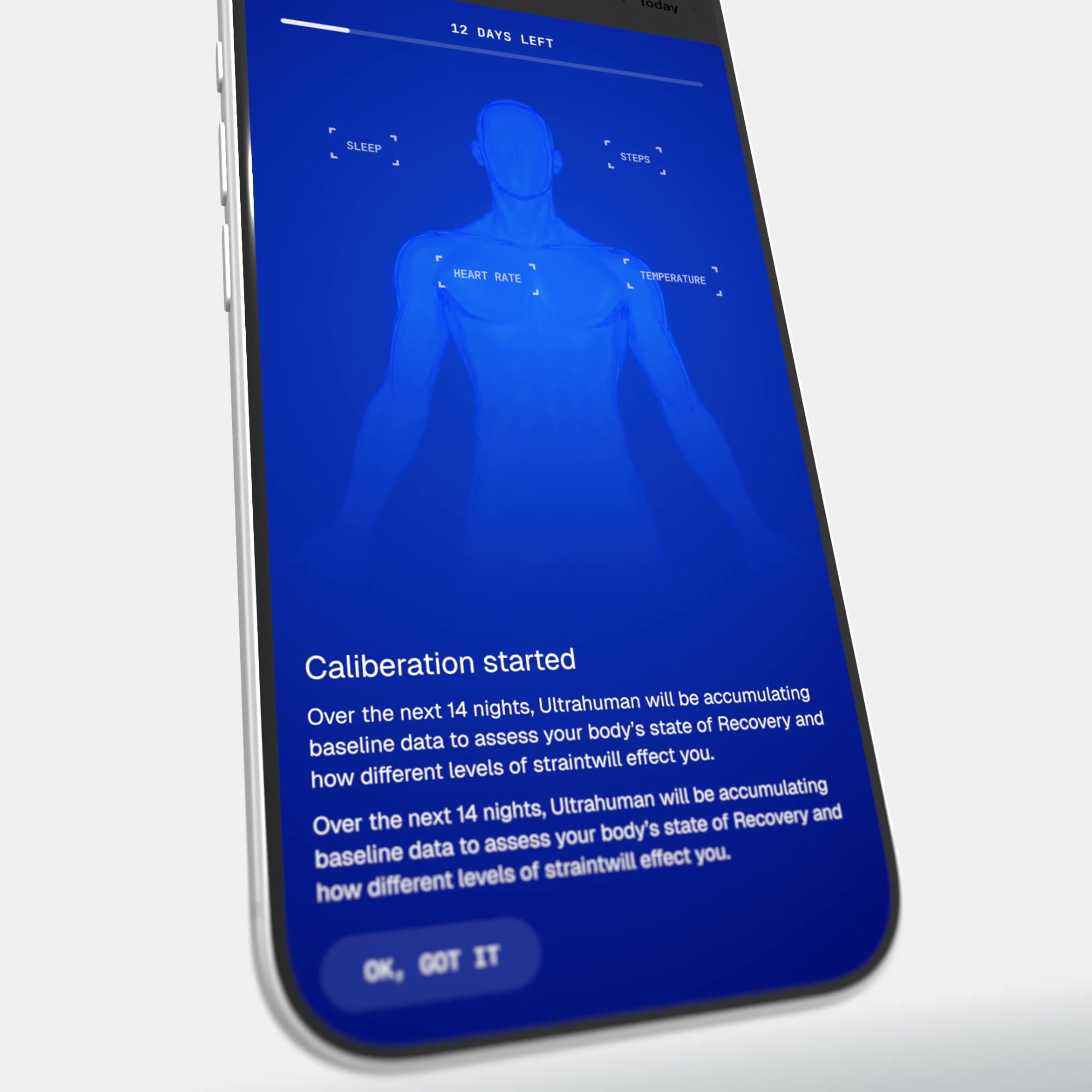
The first twelve days
A ring knows nothing about you until it has watched you for a while. Sleep, steps, heart rate and temperature are marked on a body map as each one arrives, and the count down is shown rather than hidden, because a number still forming should not be presented as one that has.